
Project: Magazine Layout
The school assignment was to make a magazine with four articles for Magnetic Magazine. The magazine is American and focuses on what modern music have become, with the latest news on the progressive music culture and functions like a guide which navigates through music like electronic, indie rock, hip hop, disco and neoclassical. Some of their topics are sustainability, events, traveling, camping, culture and festival life.
They want the designer to create a four season magazine which they can hand out on events for free, which has a long shelf-life and strong impact. They want it to be a calm place, away from the noise and stress from social media platforms. The design needs to appeal to international audience and be appealing to the eye and easy to read.
Their target marked is 32% women and 68% men. The most dominant age group is between 18 to 34 years, but also extend up to around 44 years old. They reach out to most of their audience through social medias.
They want the designer to make a unique custom-made design for their cover inspired by an article that will be in the magazine. The same design will also be featured inside the magazine with the article.
Illustration & Design
For my illustration I used Procreate on my Ipad. I made a brain as a symbol of mental health, which is listening to music. The flowers, butterfly and calm heartbeat (the cables) represents how music can be used as therapy. I made sure to use bold lines to make the illustration look a little rough but also stand out. For the extra touch I also added a background with splashes to intensify the rough look and to give it a more vibrant touch.
Colours
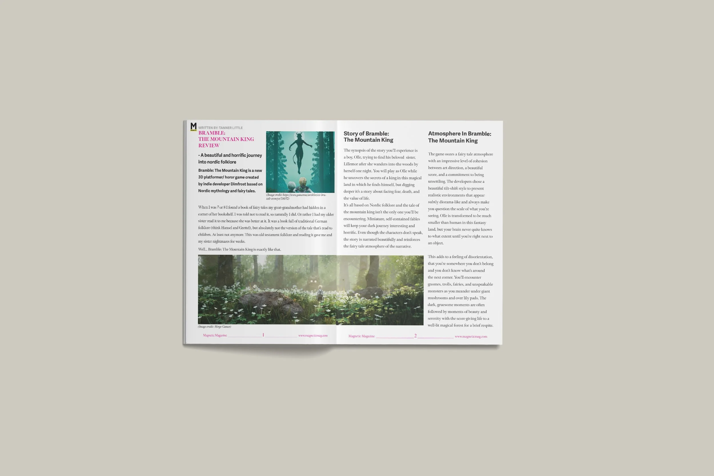
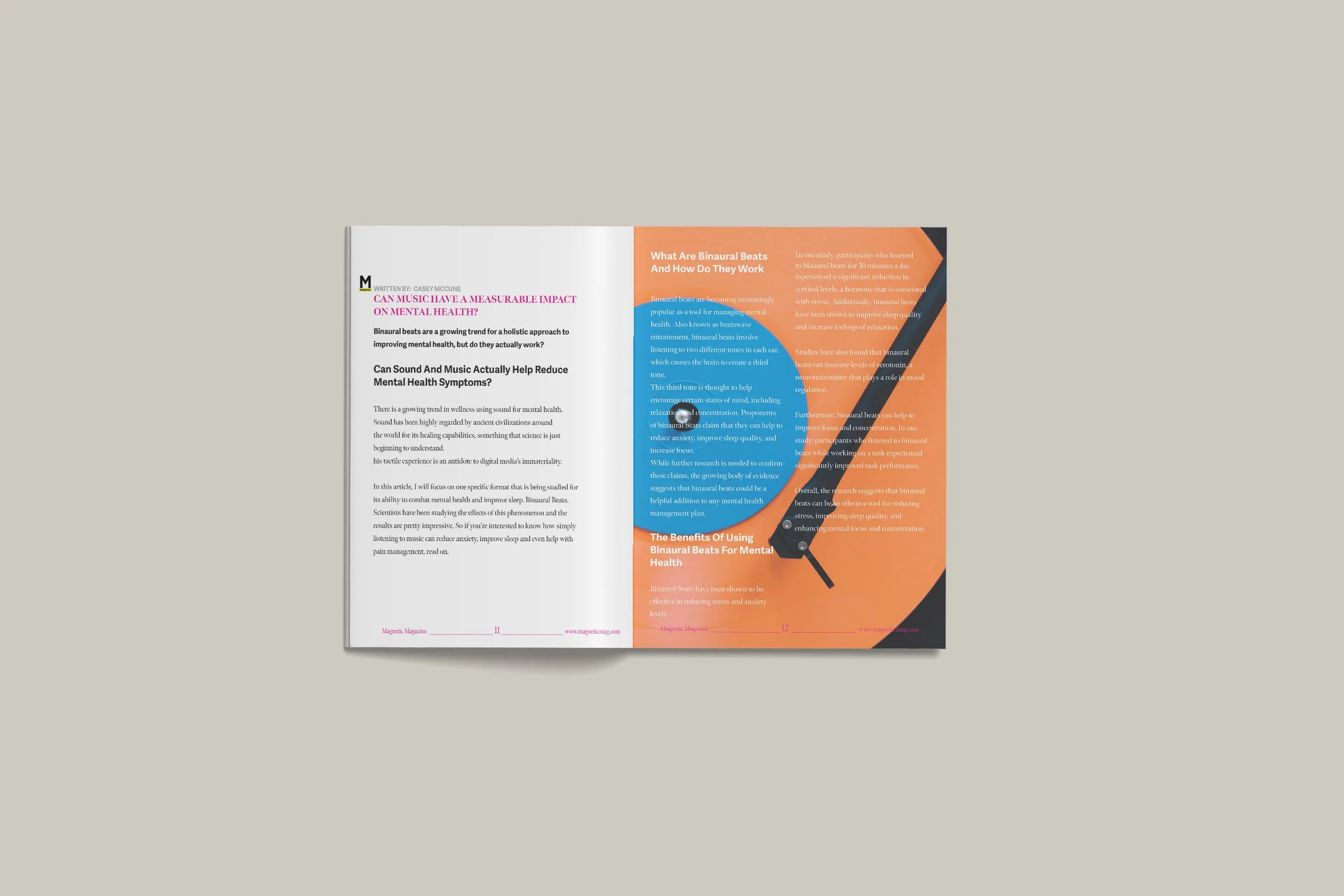
I chose vibrant colours for the magazine. The colours harmonise well with each other and gives the magazine a “festival” look. I used the colour E6007E for the accent colour, and black and white to make the vibrant colours pop.
Image style
For the images it was important for me that they stood out, and in high quality. They needed to be bold, vibrant and colourful. The pictures gives a “neon” effect which fits well with the topics, but also gives the magazine a touch of the “festival/party” vibe I was looking for.
Fonts
I wanted the font choices to fit with the logo and modern style of the website, so I chose the sans serif font Adelle Sans Devanagari for the sub-headings, introduction text and byline. To create a contrast and create the “magazine-look” I chose the serif font Meno Banner as heading, sub-headings 2 and for the body text. It gave the magazine a modern look, which is also easy to read.
A cover with the slogan “The Voice Of Progressive Music Culture”, seasonal date, magneticmag.com, The word “Free”.4 articles from their website together with layout and design,Artwork for the cover, spread with the table of contents (index), about page. Style and imagery (up to the designer to choose).format: 203mm (width) x 276mm(height)
Requirements:
Client
Magnetic Magazine
Year
2024


Project: Motion Design

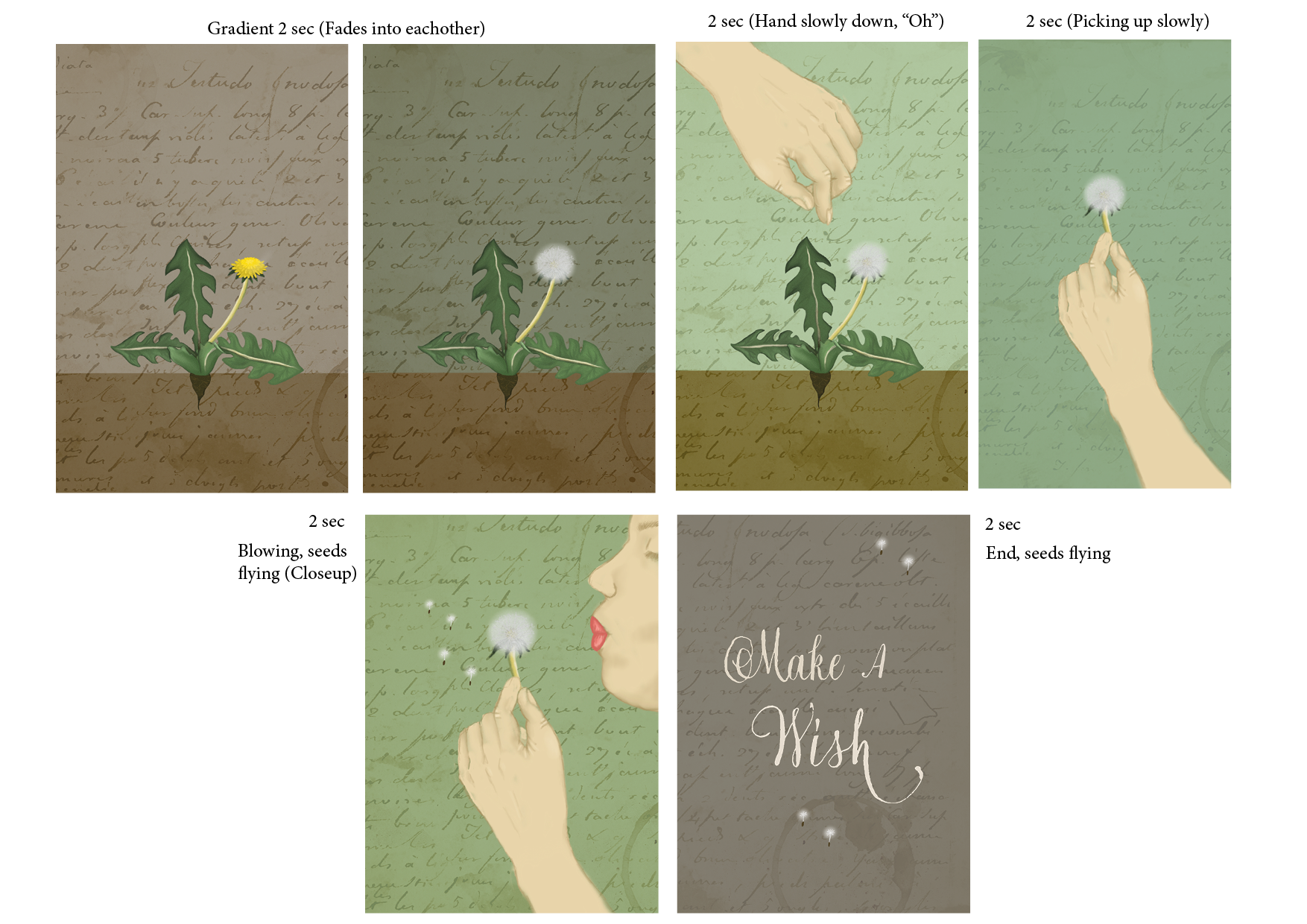
For this school assignment I needed to create an 10 sec animation in After Effects. The design of the animation was free of choice.
I chose to make an animation for Reels on Instagram, with a vintage inspired design. I made the illustrations on Procreate and then imported them to Illustrator for some last touches before After Effects.
Requirements:
Storyboard
Animated in After effects
Client
No client
Year
2024
Project: Photography

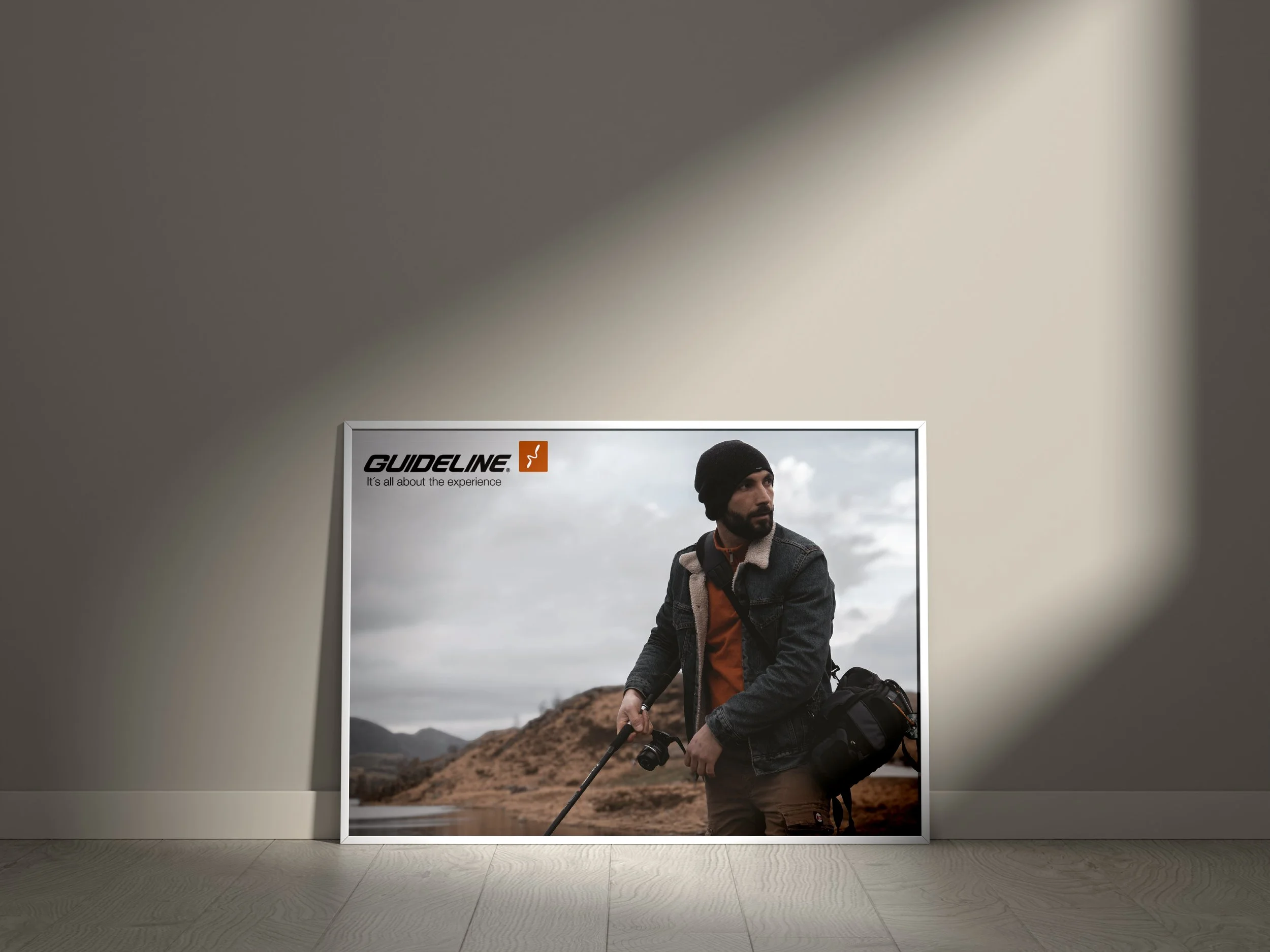


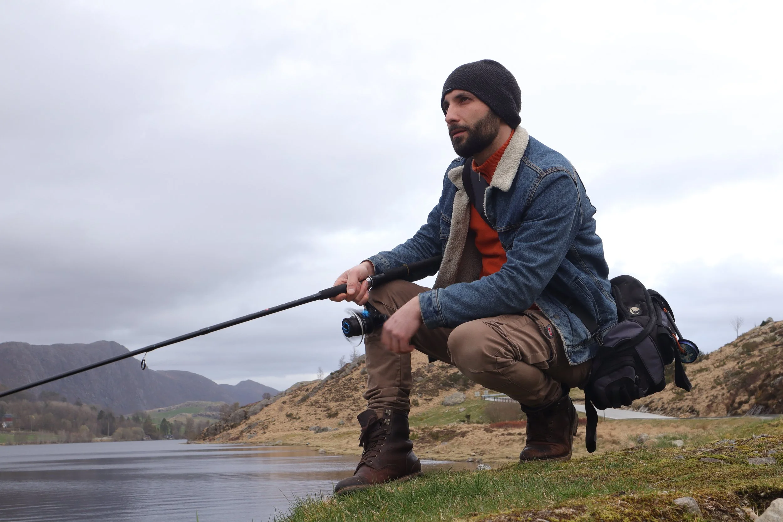
In this school assignment I was supposed to make an advert for a fictional client. The advert needed to be a model-photography in combination with landscape, astro or architectural photography.
I chose Guideline to be my fictional client. Guideline is a a known brand for fishing gear and clothes and usually uses rough looking images in nature. Me and my model took a trip to a place called Gjesdal outside Stavanger, surrounded by lakes and mountains. I took my tripod with myself but found out that for this shoot I needed to use my body more to get the right angle, climbing down some rocks ect. For the light in the pictures I was totally depending on the natural daylight, and hoping that it would not rain too much (rainy day). We went in the afternoon when the light was a little softer.
Requirements:
Hight quality photos (1 or more) which advertise a service or a product
The photo needs to be self-producedThe picture must do the talkingBasic layoutNo pre-produced backgrounds or imagesThe final advert must be submitted as a high quality A4 PDF
Camera: Canon EOS M50 Mark II Lens Model: EF-M15-45mm f/3.5-6.3 IS STM Aperture Value: 6,375 Exposure Mode: Manual exposureExposure Time: 1/60 Flash: No Flash FNumber: 9 Focal Length: 35 Photographic Sensitivity (ISO): 200 Shutter Speed Value: 1/64 White Balance: Manual white balanceEdited in Lightroom.Camera & Settings:
Client
Fictional Client (Guideline)
Year
2024